Brief 2
Her grave was in Brucklebridge Churchyard


|
Messing around with different monochrome looks and text placement in the image


|
Henna art
The Uninhabitable Earth

I looked at the concept of someone stepping on earth and crushing it like a bug, but came to the conclusion that it would look too cartoonish, like the book wasn't serious about its message.

|
I started with very basic, obvious design choice like the earth cracking or exploding, and care exhausts clouding up the atmosphere.
I also took a look at having the earth in a human hand, symbolising that the future of the planet was in out hand. But i also wanted to make clear that we were the ones destroying it too, so showing the hand crushing the earth, or the earth being squashed under pour thumb. 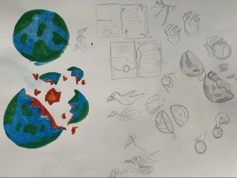
|

bones represent death, sparse and emaciation. Draining the earth of the nature and natural resources. I really liked the idea of the bones. It really brought home the look I wanted to go for.
I wanted to make the earth part of the bones because it's part of what's keeping us alive, but since the novel is about the earth being "Uninhabitable" I looked at breaking the bones of damaging them, to represent the deterioration of our earth.
I wanted to make the earth part of the bones because it's part of what's keeping us alive, but since the novel is about the earth being "Uninhabitable" I looked at breaking the bones of damaging them, to represent the deterioration of our earth.


|

|

RE-Submission
Since this book revolves around climate change I wanted to hone in on the affect the changes occurring on the animals we share the planet with. People tend to sympathise with animals, and want to help them. its very hard to look at a starving or injured animal and not feel the absolute need to help. So making animals the centre piece of my idea was important


for image referencing here I wanted to find images of a dying reef, which I found, quite a few images comparing the great barrier reef now to what it looked like before. Its rather depressing to see so I wanted to do something similar. I deliberately added more fish to the before than after to show the affect it has on out fish population

|
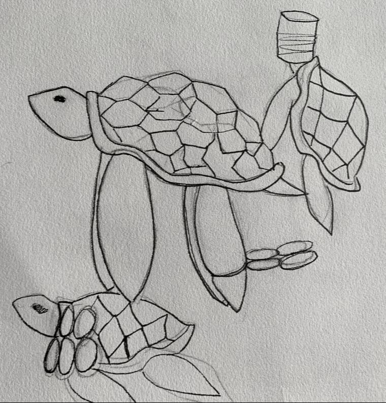
I started first by look into the affect we have on our oceans. plastic fills out oceans and harms our marine life and eco system "at the rate we are polluting the ocean with around 12.7 million tonnes of plastic a year" (100+ Plastic in the Ocean Statistics & Facts (2020-2021) (condorferries.co.uk)) It's gotten so bad in fact that we have designated ocean garbage patches. I wanted to focus on showing the affect we have on our marine life. Since our planet is mostly water i thought this was a really important point.

|
|
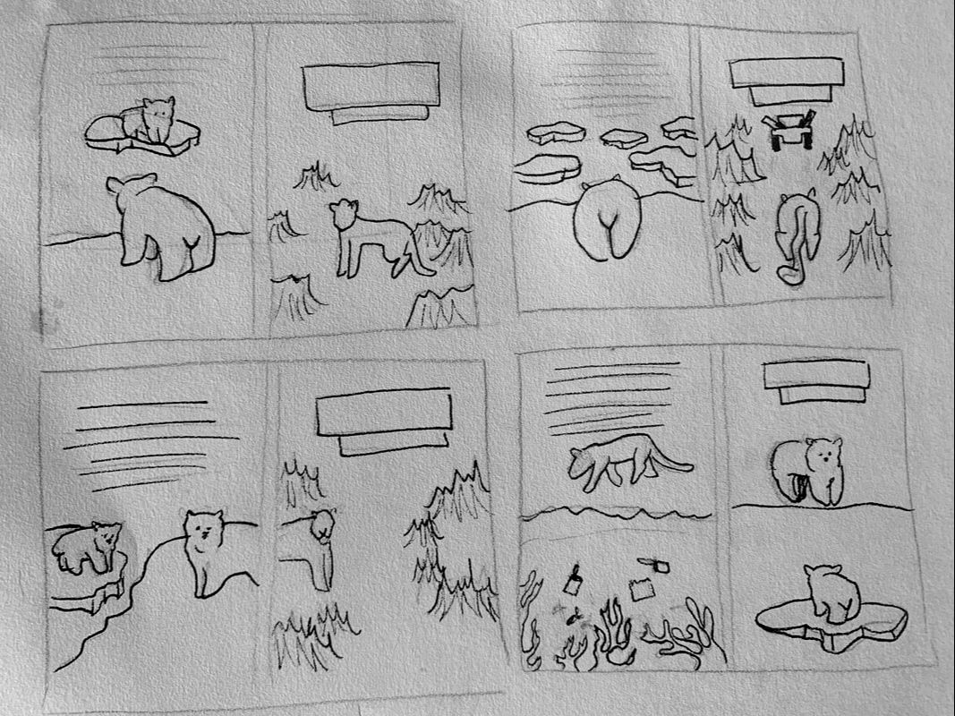
I then also wanted to look at the affect it has on our polar life. Its no secret that global warming is melting our icebergs and that our polar bears are endangered due to this habitat change. There have been several pictures that have circulated through the years showing just how affect our polar life is. While I was researching these images for references I found myself growing increasingly upset at the images, I thing its important to add something like that on a book like this. IT not only pushes people to read it to find out what's going on, but plays enough on the sympathy of humans to perhaps push them to help.


Due to deforestation and climate change half of the worlds rainforests have been destroyed, and with that the homes of all the animals that inhabit the rain forests, leopards being critically endangered due to the destruction of their habitats. The wide range of bird species are also affected, 1/3 of the species are expected to disappear.


Here I drew a leopard and tiger in the straight lined style I was looking at before. Using a block colour for a simple design.
I also looked at the fact that our bees are disappearing, though they're annoying they are extremely important to our ecosystem. Since bees are one of the biggest pollinators on the planet. But as our climate changes the growth of these plants are dwindling, as we destroy forests and meadows. which no plants they cant draw nectar leading to the disappearance of bees, and with out bees our plants are less and less likely to pollinate.
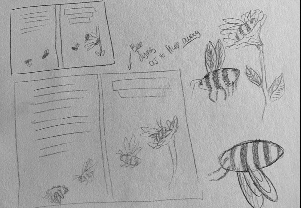

I again tested the straight lined, block colour idea with Bees here, I think it worked best with the bees considering they're black and yellow, and the black likes don't seem so harsh.


|


I also wanted to tug on heart strings by separating mother with her cubs. Its always upsetting to see mothers separated with her children and that includes animals, especially when we are key players
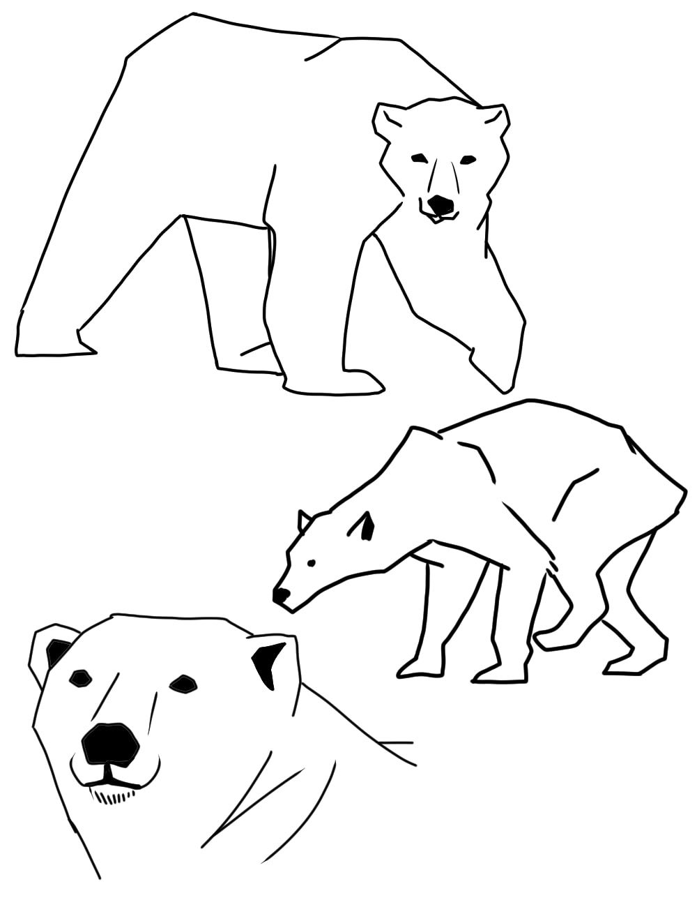
I used references with these images, in the block/ straight line art i was looking at.


|


In the final I decided to do somewhat of a contrast/cross over. Its hard to pin point and focus on just the one issue we have created, its impossible to fit all of the issues on one cover. I chose what affects me, I cant speak for everyone but being human it affects me just as much as anyone else so its not like people wouldn't be able to relate.

Making the invisible, visible
(Illu 6030)
(Final Project)
In this project we were given free reign to write our own breif anf produce our own set of work on the guidlines we set (all be it with some guidance) as fun as this idea was for me and my peers, I actually struggled intially quite a bit in decided what exactly I wanted to do and what topics I wanted to cover. I had alot of ideas thrown at me but one that really seemed to work with me was the idea of covering mental health and its affects on people and their lives.
Though poor mental health can affect a person as much as poor pyshical mental health it often isnt seen that way, and even in todays society we are still told to "suck it up" or "just try" or comments along those lines. These comments are unhelpful but often times the people saying them aren't intending to hurt anyone. There is a lack of understanding with mental disorders, since people cant see them they have a hard time empathising and understanding why people who are ill this way behave like they do, to them it can come across as lazyness when a person with depression sleeps all the time, or as cowardess when a person with anxiety struggles to speak in large groups or partake in any social events. My aim in this project was to somehow represent or give a greater understanding to people who struggle to understand mental wellness.
Though poor mental health can affect a person as much as poor pyshical mental health it often isnt seen that way, and even in todays society we are still told to "suck it up" or "just try" or comments along those lines. These comments are unhelpful but often times the people saying them aren't intending to hurt anyone. There is a lack of understanding with mental disorders, since people cant see them they have a hard time empathising and understanding why people who are ill this way behave like they do, to them it can come across as lazyness when a person with depression sleeps all the time, or as cowardess when a person with anxiety struggles to speak in large groups or partake in any social events. My aim in this project was to somehow represent or give a greater understanding to people who struggle to understand mental wellness.
|
I knew fairly early on I wanted to make a comic or picture novel to showcase my ideas and any representation of mental health. I didnt, however, want there to be too much of a narrative, people experience mental disorders in different ways and making it too specific could muddy up peoples ability to connect.
With the narrative out the way I had to settle on what Mental Health issue I wanted to cover, there are so many and accurately representing all of them is a fairly large taking. I emailed many mental health charities for information or experiences they could share. (For privacy issues I cant show much of the reponse) 

|

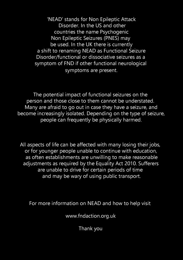
I eventually settled on NEAD (Non-epileptic attack disorder) these are seizures that happen as a result of dissasociation and affect people with epilepsy as well as people with out. As some one who suffers from both Epilepsy and NEAD, it means alot to me to get the word out about this disorder, especially since its not often spoken about and is a fairly recent discovery. For a more indepth idea of what NEAD is I did some research on all that NEAD is, all can be summed up in this PDF.
| ||
Imagery and artistic representation
I decided I wwanted to go with a horro-esk comic, to envoke even slightanxiety in readers in an attemtp to replicate the feeling people who suffer from NEAD feel before an episode. I started by looking at horror comic artists, my favourite of which was Junji Ito, Junji Ito's work is very unique and his stories are obscure ad the imagery disgusting and unerving, exactly what I was aiming for, for my all be it shorter comic.

I appreciate the line work in Itos work, and even with the lack of colour still makes disturbing images. the black and white making even more so. Though I used Junji Ito as an itital inspiration I wasnt 100% sure I wanted my human figures to look so much like his. My aim was to make people feel connected to the character. Often times in animation and cartoons their main characters are soft featured and fairly cute so I began looking at different ways to drsw out protaganist/the main character featured.


Though the images of the general public being the enemy was creepy I wanted to avoid vilifying the people we want to understand mental health, and I really wanted to hone in on how people feel on the inside, to avoid making people like they are to blame, I decided that focusing on a physical depiction of the mental illness instead of people arounf them.
Creating the beastyWith my mind made up I began to start the design process of my monster I wanted my beaty to induce a sense of axniety and initial dread.


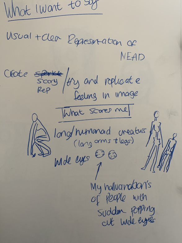
I decided to play into my fear of extremely thin and long humanoid creatures. They provoke a sense of anxiety to me. Things like slender man look human enough, but there xtra long arms and legs and thiness put me on edge so i wanted to create something of that nature. I settled with this final design with the pointes teeth and elongated faces. I wasnt sure what to do with the eyes, i didnt want them to look goofy, so I eventually settled on a kind of void looking eye. With a deepset hollow eye darker on the edge to give the illusion that its looking at you or something even though the eyes are hollow.
|
I did a small brainstorm of what exactly I wanted to communicate and show in my work, feeding into my fears and what makes me spooked.
Personal experiences

Recently I myself have been especially struggling with my head and hallucinations, which is as scary as it sounds. If i have a film playing or a video on the side I will see the person on screen suddenly turned towards me adn their eyes popo WIDE open, though when I look at the screen or rewind nothing of the sort occured. Hallucinations are a common symptom of seizures so I thought it was important to look into images of my hallucinations

Representing the aniexties in societyI dont want the construct of how this affects someone in society to be lost completely so I looked at imagery and how to represent that.


One of my designs involved a rather large monster, big and tall to be intimidating, though no matter how hard I tried I struggled to actually make it scary. He just kep coming across as rather silly looking or like jabba the hut. I tried referencing from the pale lady from "Scary stories to tell in the dark" but even she looked a bit silly. In the end I decided to play on my own fear.


|


Character design
|
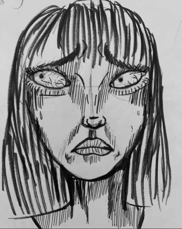
I needed the character we are suppose to relate to, to be relatable enough to look at but also to fit my horror theme. She needed to look on edge but not complete scary for her to be confused or also recognised as also a monster. I aim is to stop the demonisation of mentally ill people and gain peoples understadning at the end of the day.
With the "not wanting her too cartoon or too real" in mind I settled on slightly softer outline features, only honing in on the reallism when In close shots or when I need to provoke SHOCK or fear.
|
|
I also looked at possible angles we would see her at, over the shoulder angles, looking up at her and looking down, I wanted a decent range of expressions for the figure model, the piece is about feeling and the best way to convay that is through exadurated expressions.

|


In regards to the space helmet/Fishbowl on the head, before these seizures people, including myself tend to get a feeling of dizzyness or sick and In NEAD case dissasociation. The bowl was to represent that and beng distsant from everyone and everything, almost like a barrier that distorts how you hear and see. I eventually dropped this idea since i couldnt really fit it in the final.
|
I settled on the idea of slight realism that full cartoon, that way the emotion I wnated my characters to show would be easy to reperesent. Though I found like the picture on the right, that too many skin creases, over shadowing and small beedy eyes were too, creepy. Thoughmy aim is to give a sense of anxiety I didnt want that anxiety to be put forward by our "protagonist"
|


Putting it together
With the very basic notion of what I wanted to do out and how I wanted my subjects to look I started working on putting all my components together aiming for the final comic.

|
|
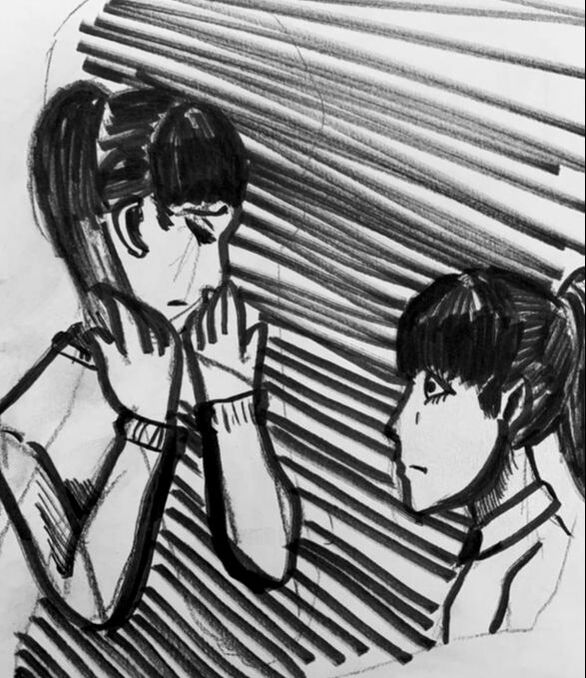
A first Idea I had was to set scene between our subect and someone else or even them self and literally mask it with the image of the beasty, representing how alot of people mask their mental health, but since it was primarly a web comic, that wasnt going to work likely, and I struggled with the contruction of the first drawing becasue the beast that was masking it was too slender and revealed pieces of the the drawing behind.
|
Covers?
|
I also looked at potential covers or even campaign poster designs. It was alot of fun but I struggled to find a design that didnt give everything away, but in the other end of teh spectrum I couldnt give it a cover that would be unqiue or eye catching enough to not be ignored as just another horror.

|

|


|
LayoutsNow I began looking at backgrounds, panel layouts and how I wanted them to look, I had to set the stage appropriatly so tried out affective layouts and shading/shadowing to create the best atmosphere.
I started by looked at room shading and the best way to make my sceneray as ominous as possible. I wanted the shading to make it look dirty and musty, somewhere you'd think "wow this place looks like it smells old" weirdly enough it seemed to depend on what direcetion my shade lines were going in.

I also drew a few example panels and pages, playing with panel cross over, and characters/beaties breaking out of their respective panels or not having boundaires at all. I wanted my pages to feel muddled and uncontroled, especially when it came to the beasty. Since the intention was to unease for me giving the monster no restructions (panel wise) made it feel alot less predicatble and even htough not explicitly in the scene, it would be slightly over lapped over making him feel ever present, just like the feel of the anxiety before an episode. My only worry making the un-panelled images look coherant with the rest of the comi, conisdering the intense shading I did want it to look too jarring with just a block of shading, that would also defeat the purpose of free panel!
|

I tried out a few shading techniques here to see whether the direction of shading had any affect on the ultlimate product, turns out it did. I foudn the shaded lines pointing down to be alot creepier, like something is dripping from the walls and panels. Though thats not whats happening if gives the uncertain edge which I wanted.


|


|

|
I worked a a couple of thumbnail sets ups, I ended up going with my first design over the second, the narrative seemed to make more sense than that that of the second, though I liked how some of the pannels would've looked in the second layout, the story wouldnt have made much sense on its own with out dialoh, dialog being soemthign I wanted to stay away from. Giving the character thoughts would catagorise their personal response to whats happening exluding anyone who reponds differently to their anixety and NEAD episodes. So I wanted to stay celar to be as inclusive as possible. So the first lay out seemed to work much better.

|

|
The final

|

|

|

|

|
Slight redesign


|


|


|
Using all the techniques and chaarcter building I worked on I feel I accurately created the anxiety jumbled feeling on a pre NEAD attack. This subject is very important to me and I was happy to have the oppotunity to really take a deeper look into, espcailyl since its fairly new on the medical scene. Im a big fan off horror ironically and thought the feeling of watching a horror movie is only really fraction of what someone who suffers from such sever anixety feels during an attack. By shadowing the monster and having him break his boundaires and pannels really gave the sense of constant looming and dread. Something I personally and I know alot of others who suffer with this form of sever anxiety feel. It communicates the looming and the ever increasing stress of someone who suffers with this feels in a social setting. Even though the other people in the panel's arent doing anything to target our subject our target looks like she FEELS personally targeted which is another feeling that sticks with suffers.
I like how I protrayed this still un-spoken about disorder.
I like how I protrayed this still un-spoken about disorder.