charlier.grillust.uk
  • Home
  • Portfolio
  • Grap2040
  • illu 6030

Improving my site

9/7/2021

0 Comments

 
A good website is important to have especially when looking into becoming a professional graphic designer or illustrator. To have a clear and easy to navigate website looks professional and shows examples of your work in a batter light ot any potential employers There are both good and bad examples of artists websites. Unfortunately mines falls under the not so good example. My website very much represents my head space at the time of creating it. As a result it is very messy, hard to look around and resmbles something similar to a pdf. 
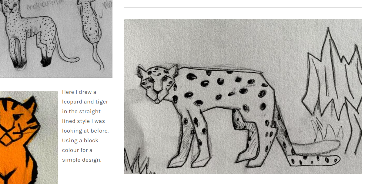
Here for example I use a little annotation (That later becomes alot more, and still so yet so disjointed) to talk about a sketch I worked on, only its situated in amongst many other sketches OF similar things and is just dropped in between images rather messily. It's unclear where the annotation is directed. Once reading the comment it become much easier understanding what Im talking about and  where to look. But it shouldn't take SO much effort to work it out. Making it clearer where the comment is directed from the get go the easier it is for me and anyone looking at my website.
Picture
Picture
I also have no navigation bar, this in part due to fact  that all my work is on ONE page. So my "website" really resembles more a PDF than anything else. Splitting my work up appropriately would make look around so much easier. As it is right now, to find a particular project you have to scroll through the webpage and find the project you are looking for. Not only is this counter producitve but its also very confusing, with every chance you could be reading the wrong thing.

TO-DO List 

There are many ways to fix my site and make improvements for starters. Looking at other artists and their sites, its easy to make clear improvmants;

-A navigation bar 

(need a nevigation bar to get through my website easier)
-Splitting my work 
(Put each new project on a different webpage so theyre not all sharing one and it's easier to look around at the correct work, and easier FOR YOU to organise yourself)
-Spacing and dividers 
(Make where annotaion is suppose to be very clear, space work out appropriately so it can all be appreciated rather than jumbled up) 
-Annotation
(make annotations clearer to understand a little more exanpansive rather than one off small comments.)

0 Comments


Leave a Reply.

    Author

    Charlie 

    RSS Feed

Site powered by Weebly. Managed by 34SP.com
  • Home
  • Portfolio
  • Grap2040
  • illu 6030